Showing posts with label data visualization. Show all posts

Monday, August 1, 2011

Mining and visualizing twitter from RStudio in EC2

Here's code I'm going to use for my ICPSR class today. This is set up to run immediately from an EC2 instance of my AMI agongRStudio2 (ID:ami-1bb47272). It's the simplest introduction to text mining I've been able to pull together so far.

Step-by-step instructions for getting started in EC2 are here (pdf and docx). These are intended to get you started in command-line R. For this exercise, we want to use the RStudio GUI instead, so there are a few changes.

1. On step 6, use this Community AMI:
agongRStudio2 / ami-1bb47272

2. On step 8, you don't need to download the keypair. "Proceed without a keypair" instead.

2. On step 9, you also need to enable port 8787, the port the RStudio server uses.

3. On step 11 stop following the tutorial. Instead, open up your EC2 URL in your browser, with port 8787. It will look something like this:
http://ec2-123-45-67-890.compute-1.amazonaws.com:8787/

4. I'll give out the username and password in class. If you're not in the class, email me and I can clue you in.

5. Here's a first script to run

library(twitteR)
library(tm)
library(wordcloud)

#Grab the 200 most recent tweets about #bachmann
#http://www.slideshare.net/jeffreybreen/r-by-example-mining-twitter-for
k = 200
my_tweets <- searchTwitter("#bachmann", n=k)

#Convert tweet status objects to text
#http://www.r-bloggers.com/word-cloud-in-r/
my_text <- data.frame( text=unlist( lapply( c(1:k), function(x){my_tweets[[x]]$text} ) ) )

#Convert text to a tm corpus object
my_corpus <- Corpus( DataframeSource( my_text ) )
my_corpus <- tm_map(my_corpus, removePunctuation)
my_corpus <- tm_map(my_corpus, tolower)
my_corpus <- tm_map(my_corpus, function(x) removeWords(x, stopwords("english")))

#Convert corpus to matrix
tdm <- TermDocumentMatrix(my_corpus)#, control = list(weighting = weightTfIdf))
m <- as.matrix(tdm)

#Get features and frequencies
v <- sort(rowSums(m),decreasing=TRUE)
d <- data.frame(word = names(v),freq=v)

#Display as a word cloud
wordcloud(d$word,d$freq,min.freq=5,use.r.layout=T,vfont=c("sans serif","plain"))


#Basic bluster analysis of words
#From: http://www.statmethods.net/advstats/cluster.html
m2 <- m[colSums(m)>15,]

dist_matrix <- dist(m2, method = "euclidean") # distance matrix
fit <- hclust(dist_matrix, method="ward")
plot(fit) # display dendogram
We're going to be trying this in class. I have 20 minutes budgeted, so hopefully it's really this easy.

PS - Don't forget to terminate your EC2 instance when you're done, or you will use up your free hours, then run up a smallish (~50 cents/day) Amazon bill until you remember

Wednesday, March 9, 2011

Information visualization and the Battle of the Atlantic

I've been reading Churchill's 6-volume history of WWII. Fascinating reading if you're into this kind of stuff. Some scattered thoughts on history, war, and information:

WWII was arguably the first war fought through information as much as weaponry. One of Neal Stephenson's characters in Cryptonomicon has a great monologue on this point. He claims that Nazi Germany typifies the values of Ares (you know, the Greek god of war), and the U.S./U.K. typify the values of Athena. In this telling, WWII Germany had an advantage in guns and regimentation, but the proto-hacker cryptographers of Bletchley Park, etc. ran rings around them with information. I recommend the monologue, but not the whole book.

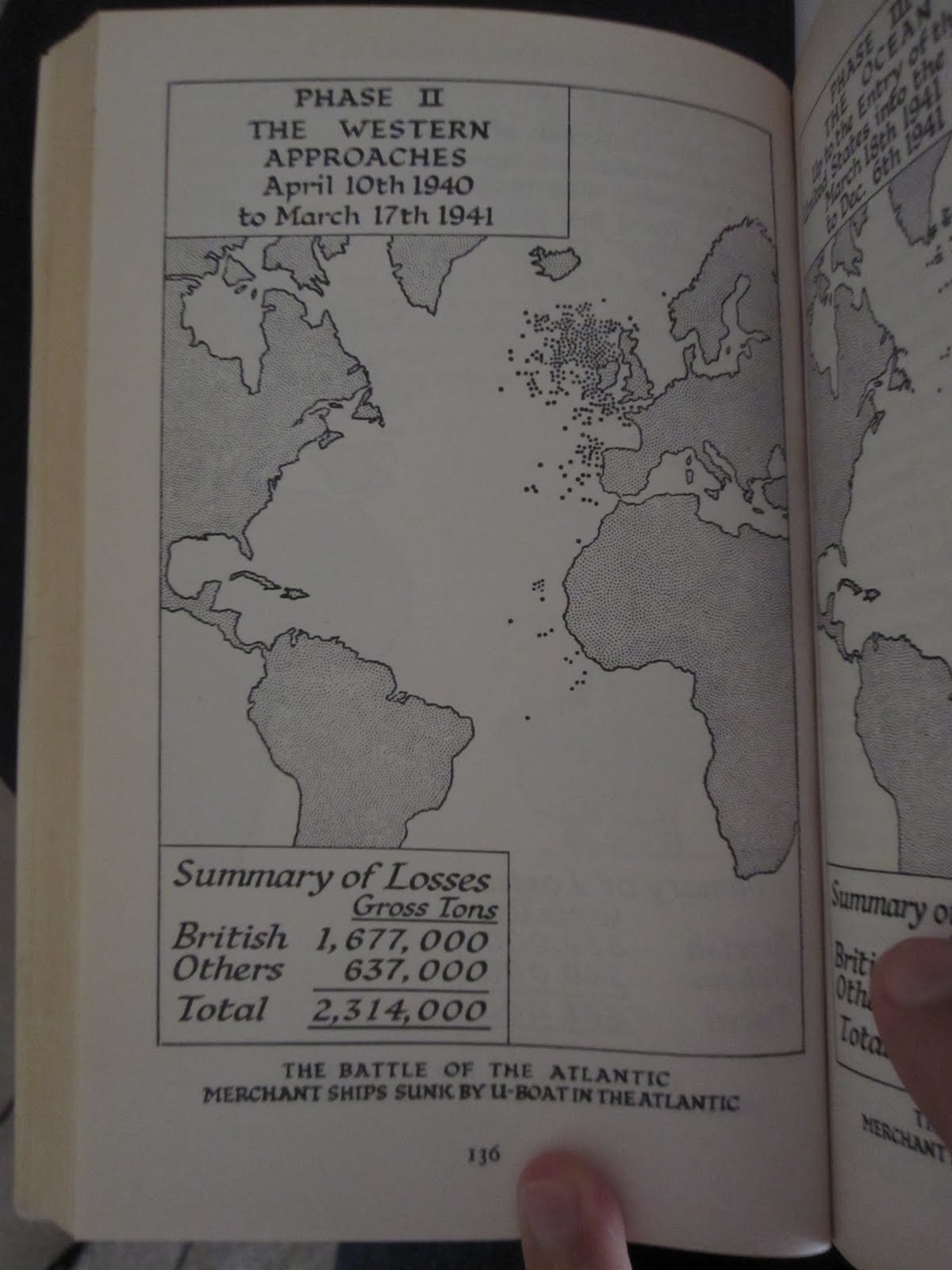
This comes out in Churchill's narrative. Exhibit A is a set of FlowingData-esque maps of merchant ships sunk by U-boats throughout the war.

A little background: in the middle part of the war (once France had been defeated, but before Russia and the U.S. had entered) the "Battle of the Atlantic" was probably the single most important "front" in the war. As long as England was connected to her colonies by convoys of merchant ships, she could continue to fight. If bombing and U-boat action could constrict this flow of trade sufficiently, the little island would have no chance.

Exhibit A: (scanned on the cheap with my pocket digital camera)


Charts like these make it clear that Churchill was interacting on wartime data on a day-to-day basis, and that that flow of information was crucial to war effort. Churchill likes to attribute success to the bulldog-like grit and willpower of the British people, but it's clear from his narrative that the flow of information was at least as important. In war, grit doesn't matter much without gunpowder.

In addition to maps, Churchill gives statistics and monthly trends for various gains and losses in shipping. They remind me of post-game trend plots in Starcraft II. The general tension between military and economy is the same. They also remind me of the dashboards that are all the rage in business process management these days. 50 years ago, you had to be a superpower at war to devote these kinds of resources to information gathering. Now, any reasonable-sized business has them. Heck, even this blog is hooked up to sitemeter. Map of the world, populated with little dots? Check.

Saturday, February 19, 2011

Best. Weather. Forecast. Ever.

Weatherspark uses the same data as everyone else, but they make it so much more usable. Gorgeous interactive maps, trends, and predictions.

Wednesday, January 26, 2011

bubbl.us: A great little tool for flowcharts

As I've gotten serious about this whole dissertation thing, I've realized that the process can get pretty complicated. "Before I can launch the survey, I need to draw the sample and write the questionnaire. But before I can write the questionnaire, I have to read the three papers that talk about measuring ideology, and ..." To cope, I've found myself drawing a lot of flowcharts to map dependencies.

Two days ago, I found this great little tool for flowcharts: bubbl.us. It's free, unless you want the premium license, and it has a really nice interface. Once you learn how to tab and shift-click and everything, you can sketch out complicated charts very quickly. If you allow it some room on your hard drive, you can even save maps between sessions. As I said, I'm using it primarily for mapping workflow, but I could see it being useful for brainstorming, simple org charts, or flow diagrams too.

And with that said, here's the map through the dissertation quagmire to the end of the semester.

Wednesday, December 1, 2010

Prezi - A quick review

I spent a couple hours playing around with Prezi, an online presentation builder being promoted as an alternative to the slideshow format of powerpoint, keynote, etc. Instead of a series of slides, Prezi presentations consist of a series of views over one large image. The format parallels drawing on a whiteboard, instead of clicking through slides on a projector. A good concept, but the execution is a little clunky.

My review: Preparing good presentations is time consuming, for two reasons: 1) it takes some trial and error to figure out the best way to express an idea, verbally and visually, and 2) presentation software is clunky, requiring a lot of fiddling to get things right. In my experience, spending time on (1) is fun and creative; spending time on (2) is frustrating and stressful.

Because of the "whiteboard" metaphor and brand emphasis on good design, I was hoping Prezi would deliver a slick and streamlined user experience. Being free from interface hassles and able focus on creative expression would be wonderful. Alas, I quickly ran into many GUI annoyances.
  • The interface for importing images is very clunky. You have to download or save the image to your desktop, then upload. On the plus side, you can batch upload several images at a time.
  • The whole image is static, which means that you can't mark up images over the course of a presentation. To some extent this makes sense -- dynamic images would mess up the concept of arranging your display in space rather than time. However, it breaks the whiteboard metaphor. When I do whiteboard presentations, I often have an agenda that I revisit, adding checkmarks and lines to relevant content. I can't do that in Prezi.
  • Rudimentary tools for grouping object are not available. This one really gets me. You can accomplish the same thing (visually) by putting several objects together in an invisible frame. But every time you want to move the group, it takes several extra clicks to select everything and drag it around. Poor usability.
  • You can only use a handful of presentation styles. Your only alternative is to hire Prezi staff to build a custom style for $450.
Summary: I would really like a tool that lets me express myself clearly, fast. Prezi offers some advantages for clarity, but not really for speed. Overall, I'm mildly impressed, but not overwhelmed. For the moment, the main benefit of Prezi seems to be novelty.

Thursday, August 5, 2010

Link mishmash

Four links worth a quick visit.

1. "Minimum parking requirements act like a fertility drug for cars." Interesting NYTimes editorial on the consequences of government-mandated parking. I'm interesting in getting the libertarian take on this one. Do minimum parking requirements distort the market for land use by overproducing parking lots and roads, or do they facilitate commerce by lower transaction costs? Hat tip: David Smith.

2. An infographic from Bloomberg Businessweek on negative buzz, doping, and Lance Armstrong's reputation. The interesting thing here is the source: automated buzz tracking services applying sentiment analysis to the blogosphere. This is a technology I plan to use in my dissertation.

3. The myth of a conservative corporate America - A nice infographic on corporate donations to politics. Good use of FEC data.

4. Some good resources for screen scraping